Roku.com Re-Design
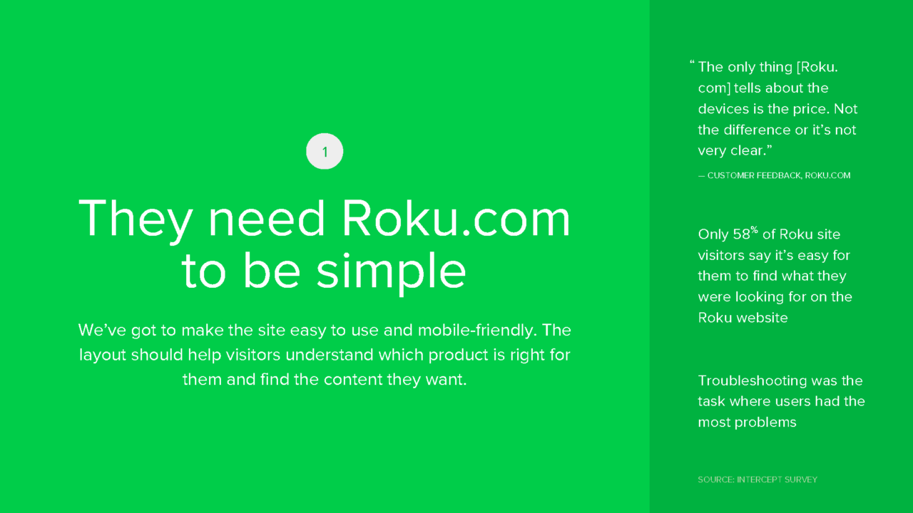
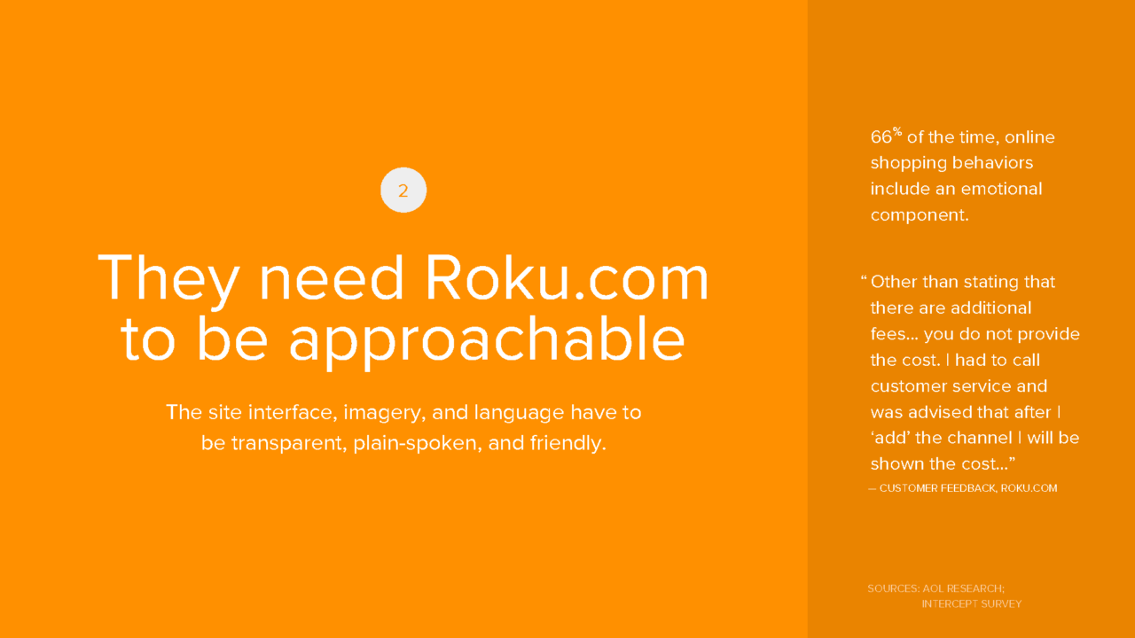
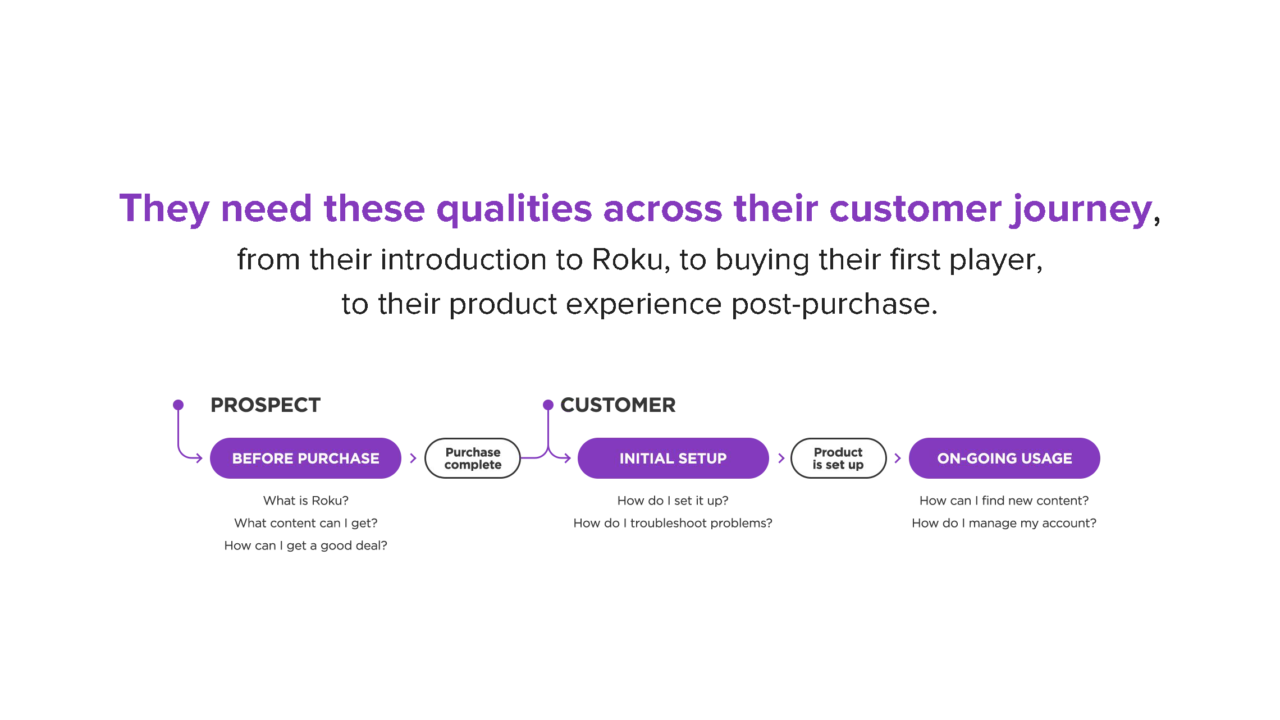
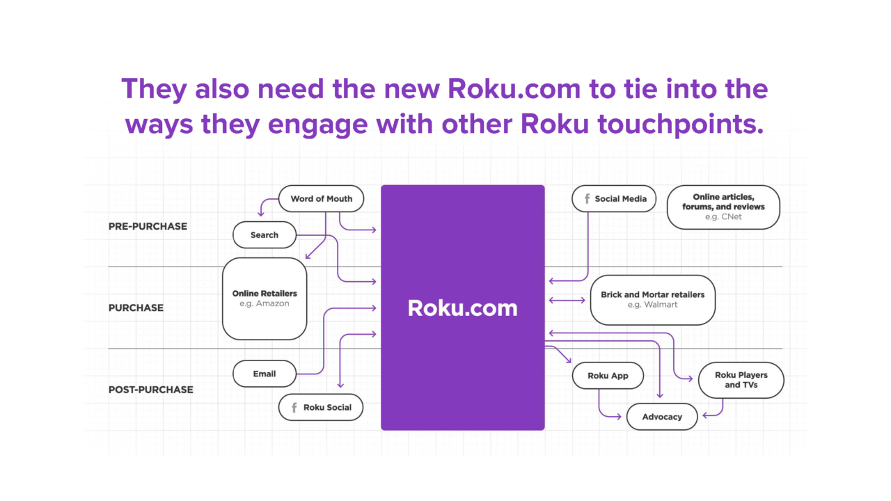
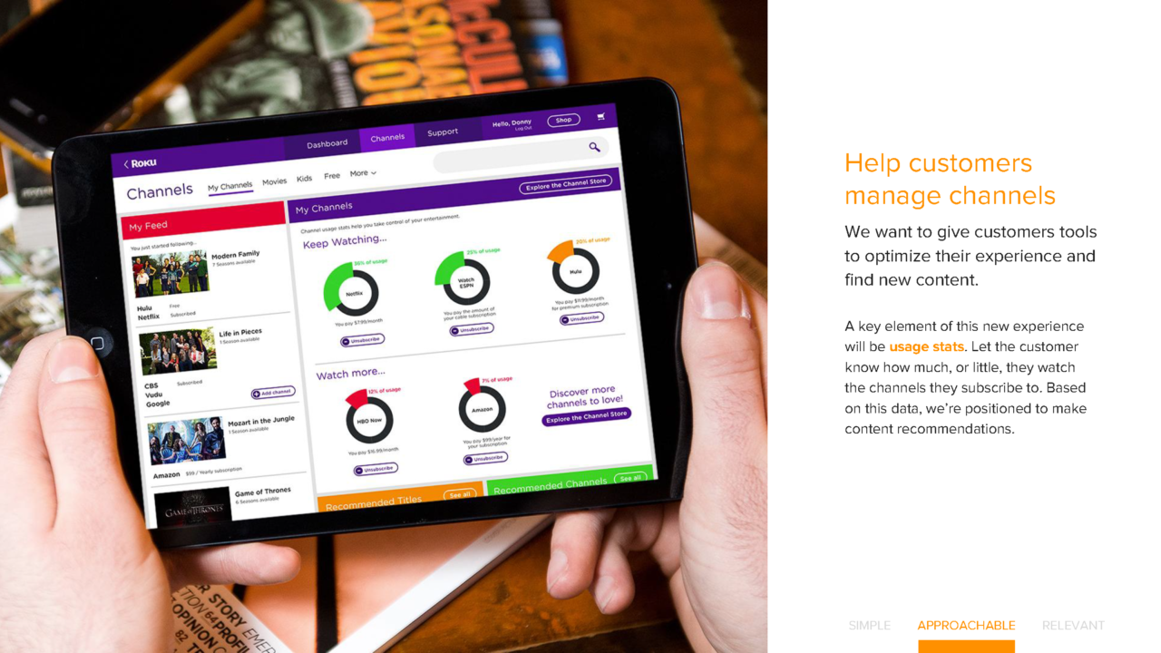
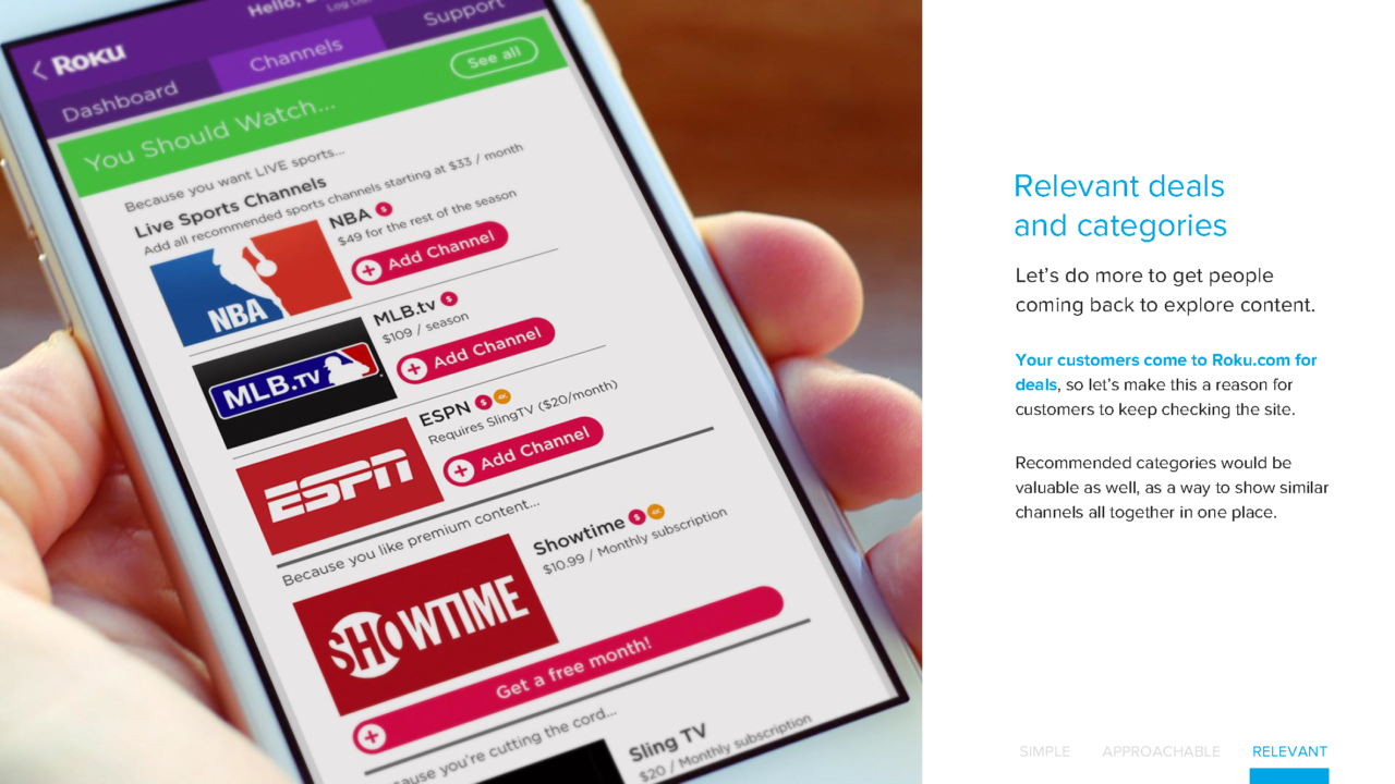
As Roku prepared to launch the biggest update to their product line up to date in he Fall of 2016, the company reached out to digital agency RED Interactive to optimize the existing Roku.com experience into a vision that would enable them to provide their customers with one unified and cohesive customer experience from top of the funnel considerations down the purchase experience through product education, content exploration, and even access to support.
Agency: RED Interactive
Project Leadership: Executive Creative Director, UX Director, VP Strategy, VP Technology
The Team: Producer, Research & Insights Lead, UX Lead, Creative Lead, Copywriter
My Role: UX Director – Design Leadership, Workshop Facilitation, UX Research & Strategy, Information Architecture, Rapid Prototyping, User Testing, Design Specifications
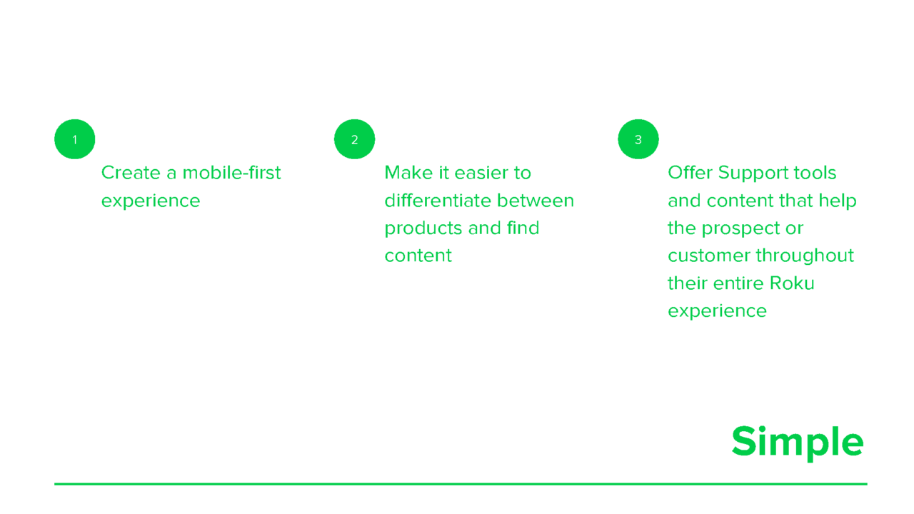
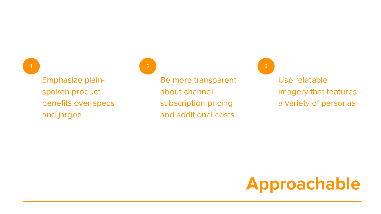
Design Strategy
The New Roku.com Experience
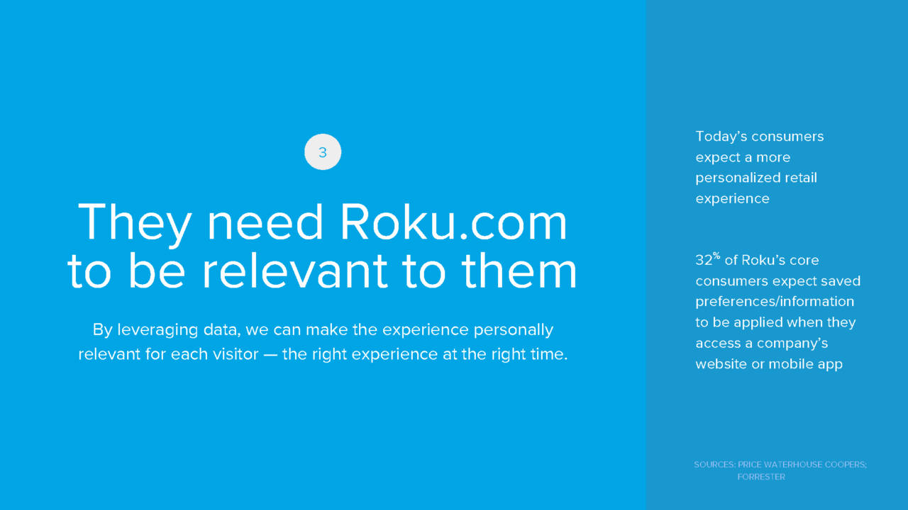
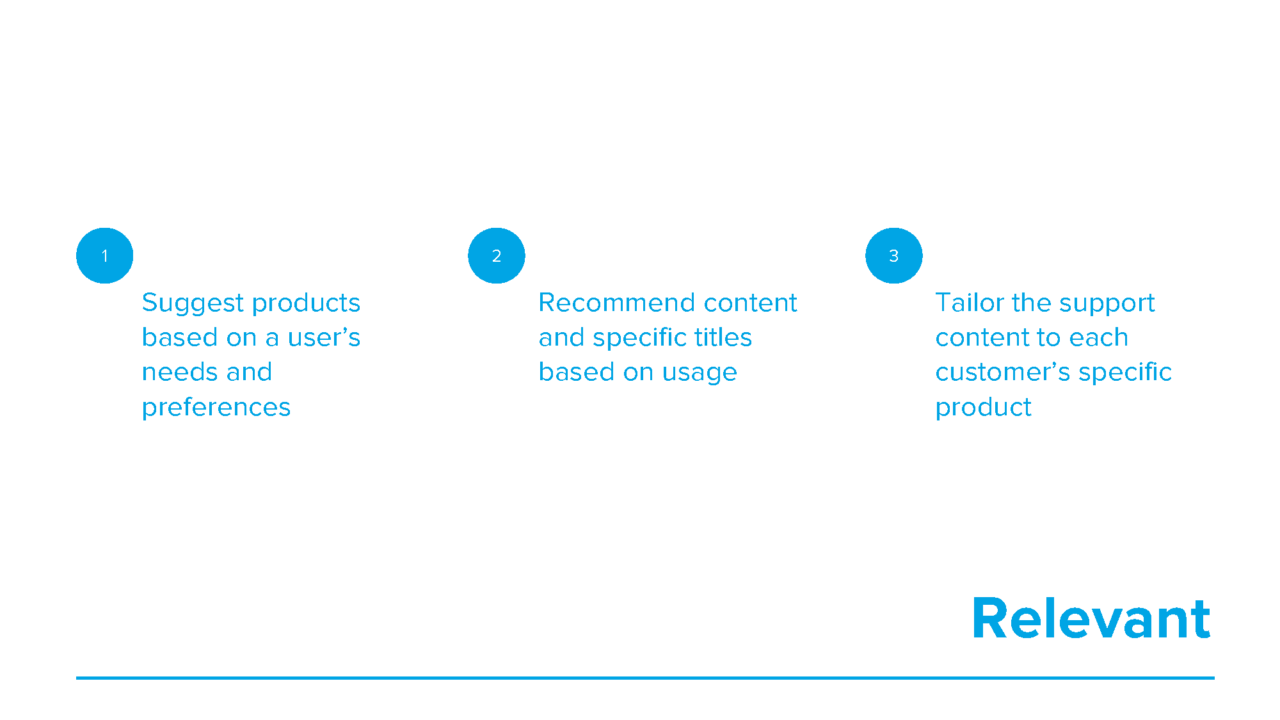
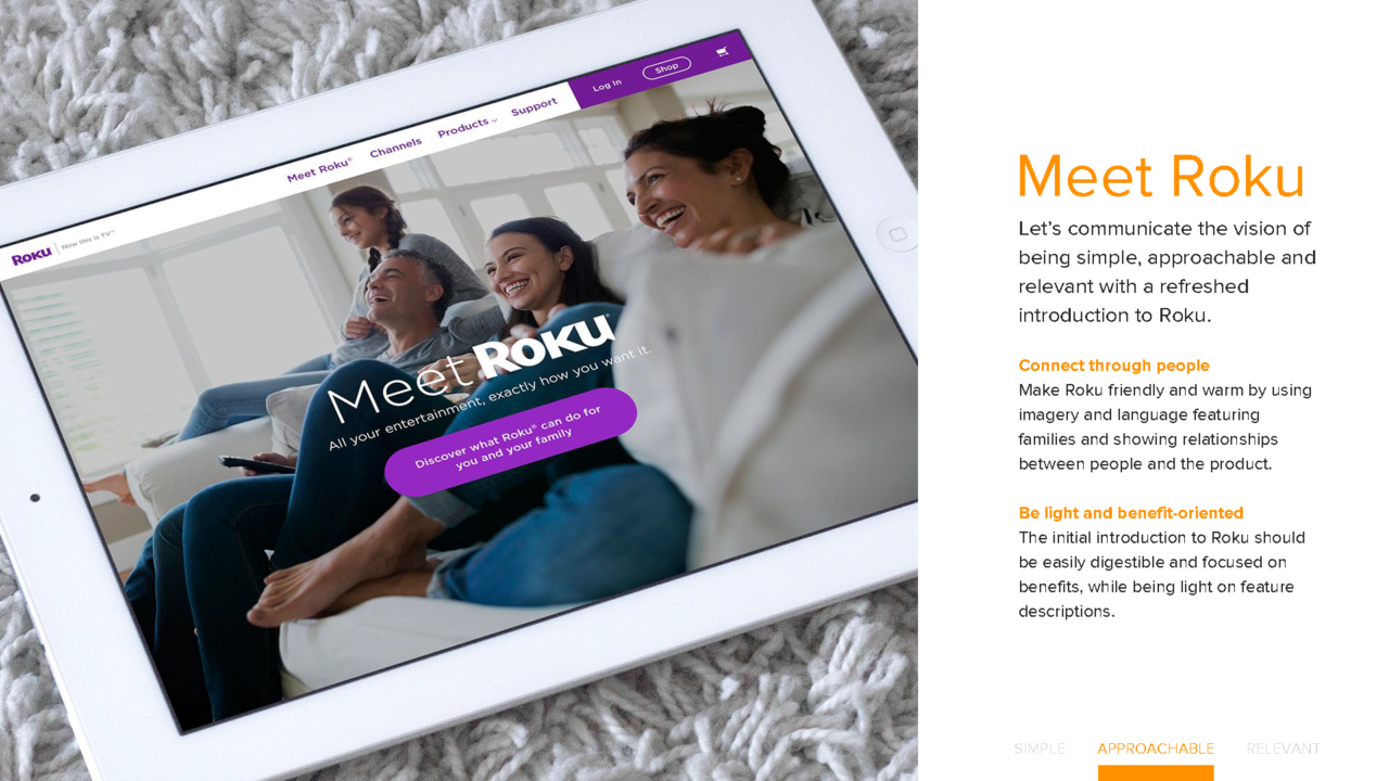
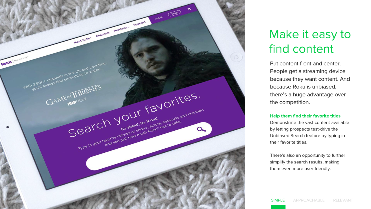
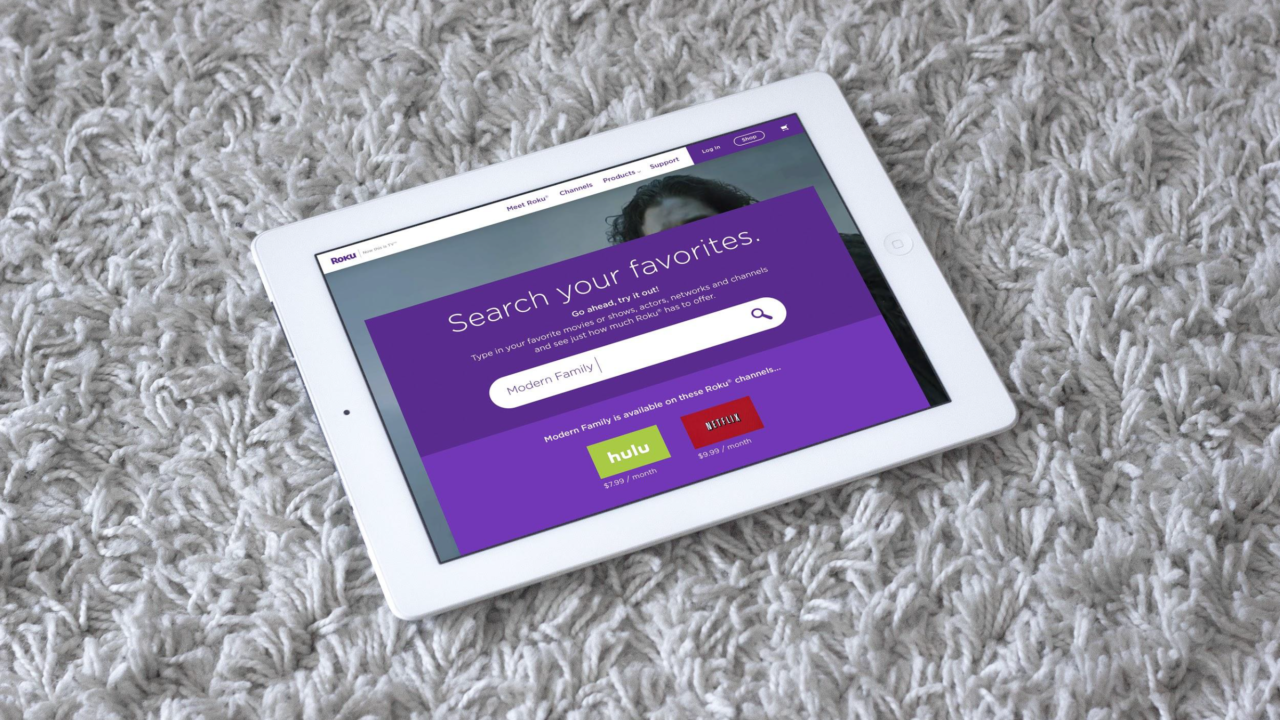
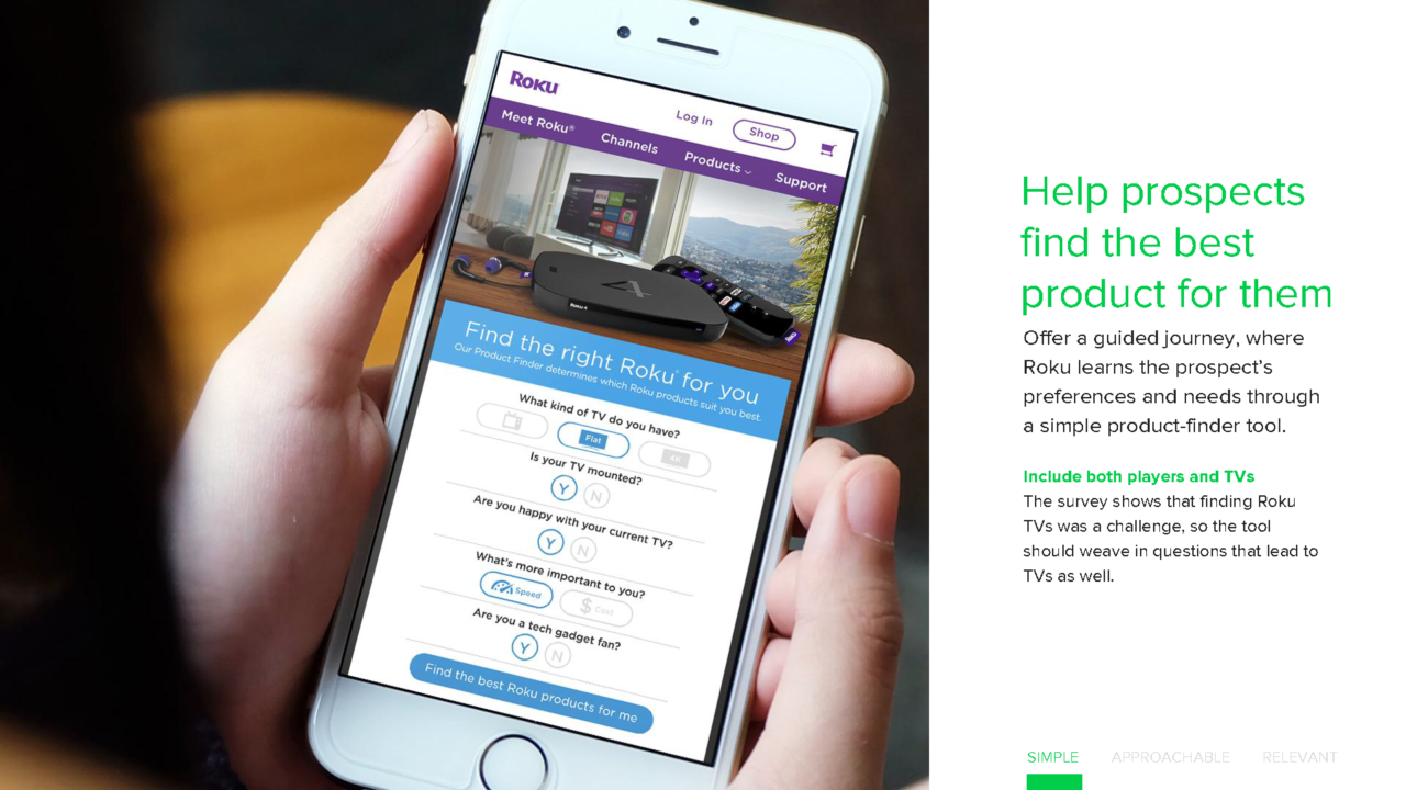
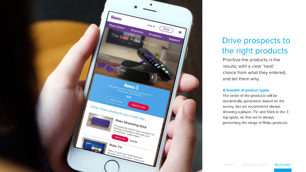
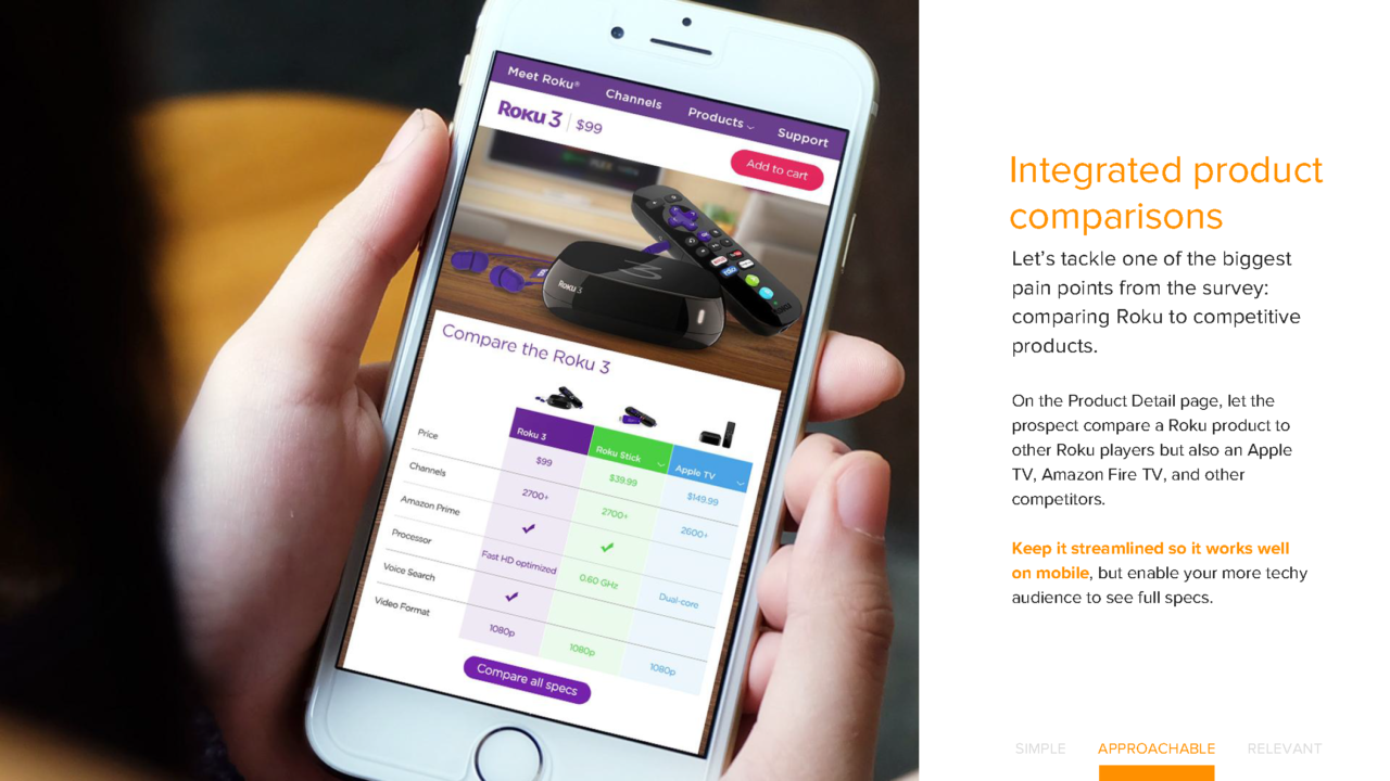
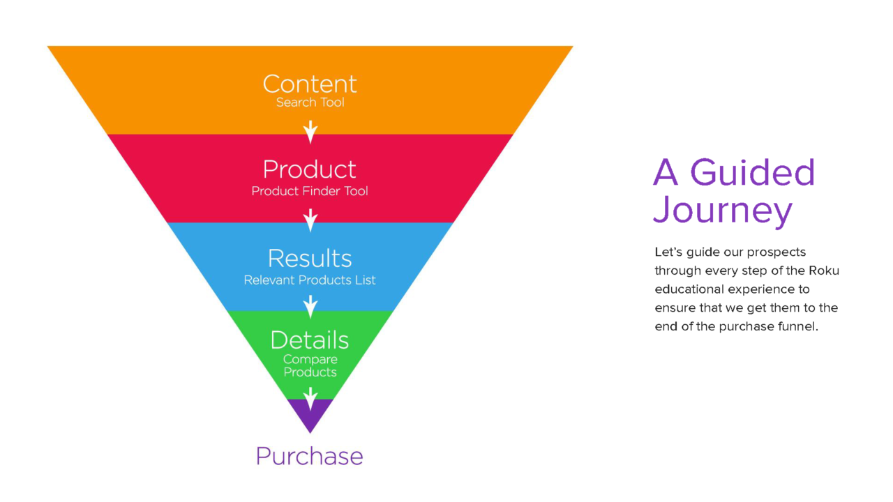
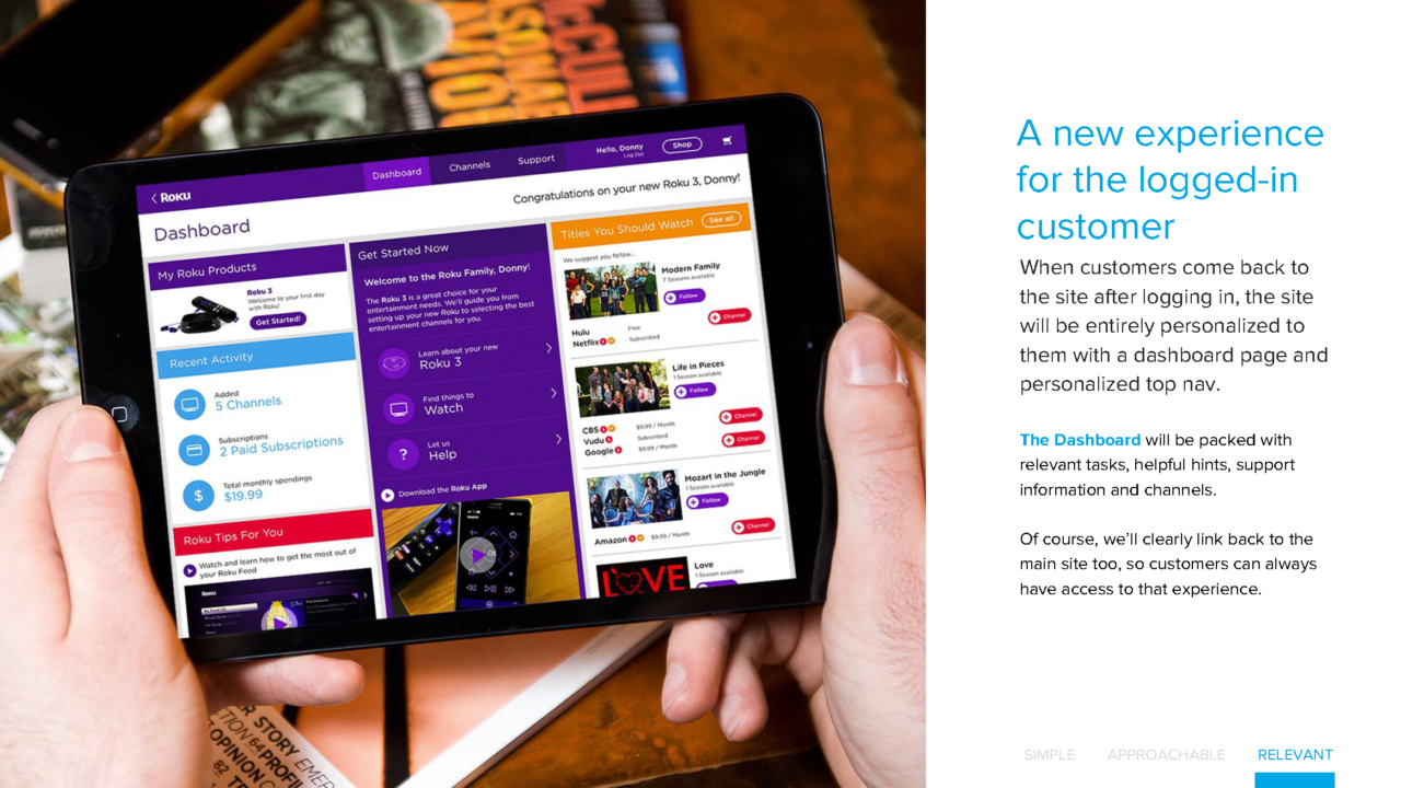
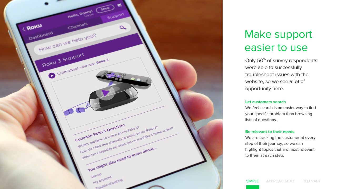
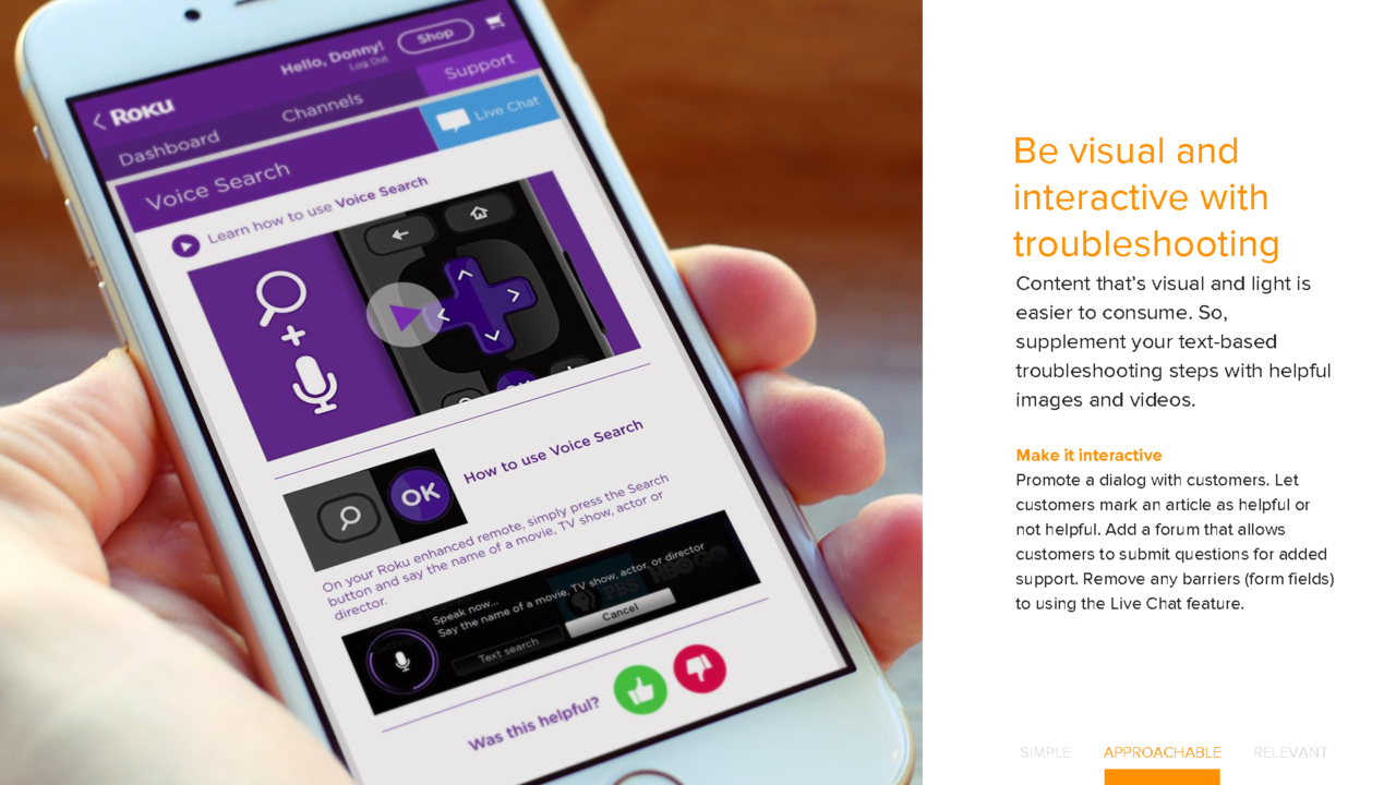
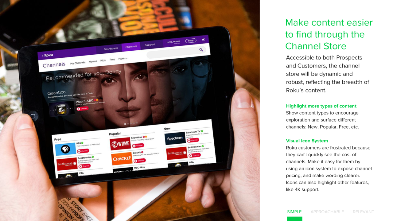
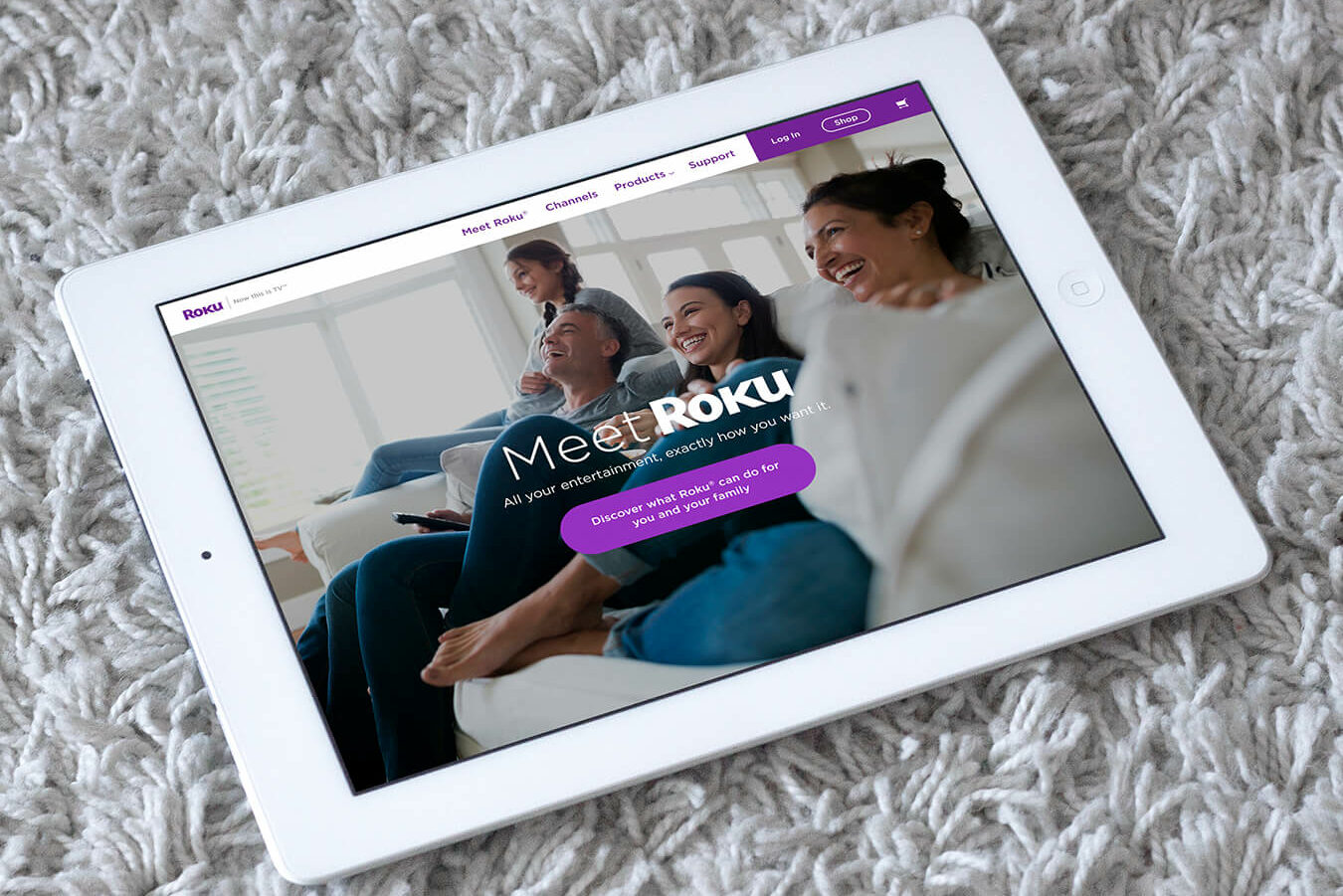
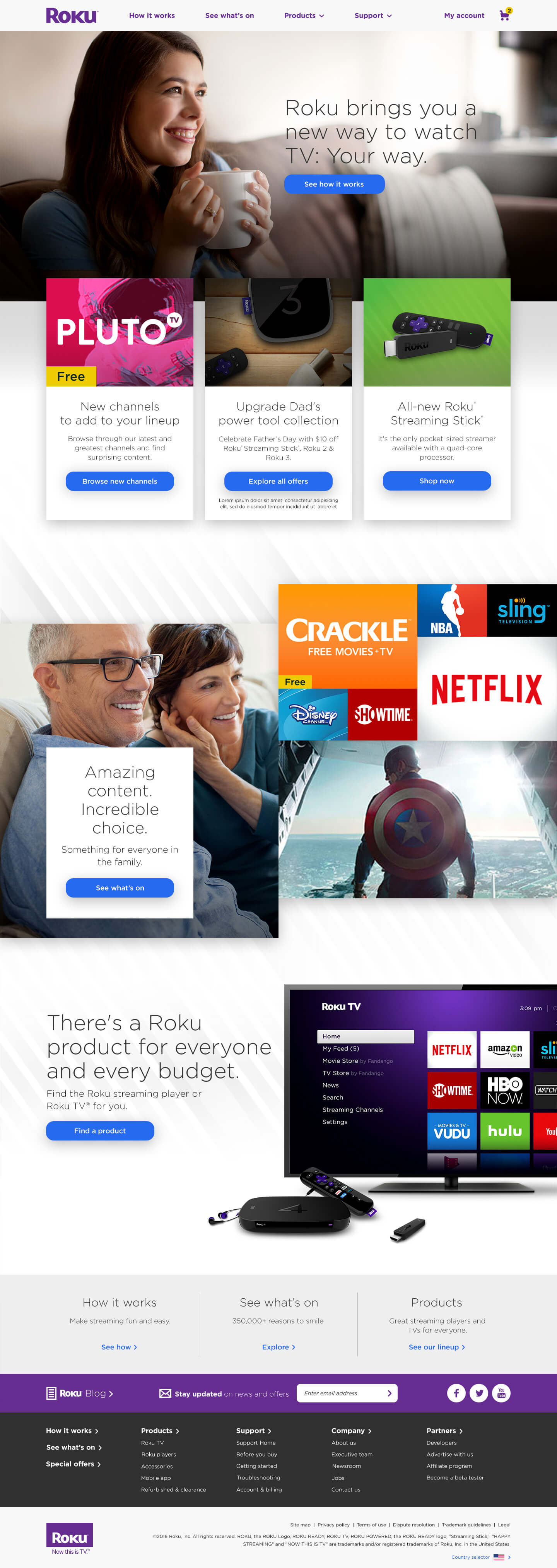
The new site provides consumers what they want most–product education, content discovery, and support. We streamlined user journeys that allow potential customers to efficiently move from discovery through conversion. The site is designed to create a clear path to follow, from ‘how it works’, through content availability and product offerings, all the way through to purchase and support.
Homepage
Products Page

Product Detail Page

See What’s On Page


